28111 sujets

CSS et mise en forme, CSS3

Bonjour,

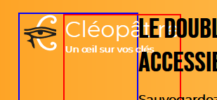
Je suis en train de retourner le web en vue d'une solution, en vain.

Parce qu'une image vaut mieux qu'une longue description, je ne comprends pas pourquoi le block bleu déborde de son block parent rouge, alors même qu'il y a de la place de pousser les éléments sur la droite.

upload/1544339091-73594-capture.png

<header>
      <div class="logo">
        <img src="logo_noir_et_blanc_new.svg">
        <div>
        <h1><strong>Clé</strong>opât.re</h1><br />
        <h5>Un œil sur vos clés</h5>
        </div>


        <!--<h5><strong>1????/?????</strong></h5>-->
      </div>

      <div class="message">
        <h2>LE DOUBLE DE VOS CLÉS <br />
        <span>ACCESSIBLE À TOUT MOMENT</span></h2>
        <p>Sauvegardez <strong>gratuitement</strong> une version numérique de vos clés.</p>
        <p>En cas de perte, nous reproduisons vos clés et vous les livrons dans l'heure.</p>
        <p>Préinscrivez-vous et on vous offre un double :</p>
        <form action="https://cleopat.us19.list-manage.com/subscribe/post" 
              method="POST" 
              class="email_trap">
          <input type="hidden" name="u" value="f091d22f5fea6963a72c6d265">
          <input type="hidden" name="id" value="6e1a1cc489">
          <input type="email" name="MERGE0" id="MERGE0" placeholder="Email" />
          <input type="submit" value="Je veux ma clé offerte !" />
        </form>
        <div class="download">
          <p class="ios"><img src="apple.svg"/>App&nbsp;Store</p>
          <p class="android"><img src="android_logo.svg"/>Google&nbsp;Play</p>
        </div>

      </div>
      <svg xmlns="http://www.w3.org/2000/svg" xmlns:xlink="http://www.w3.org/1999/xlink" width="500" height="452" viewBox="0 0 500 452">
      <image id="Vector_Smart_Object" data-name="Vector Smart Object" width="500" height="452" xlink:href="data:img/ [...] />
</svg>
</header>


@font-face {
  font-family: 'BebasNeue';
  src: url('BebasNeue-Regular.ttf');
  src: url('BebasNeue-Regular.otf');
}
@font-face {
 font-family: 'Aileron';
 src: url('Aileron-Regular.otf');
}
body {
  font-family: sans-serif;
  padding: 0;
  margin: 0;
}
header {
  background-image: linear-gradient(to right, #fea121, #fff9b6);
  padding: 5%;
  padding-top: 3%;
  padding-bottom: 1%;
  display: flex;
  .logo {
    border: solid blue 2px;
    display: flex;

    img {
      margin: 0;
      max-height: 60px;
      object-fit: contain;
    }
    div {
      border: 2px solid red;
      display: inline-block;
      width: 100%;
    }
    h1 {
      display: inline-block;
      color: white;
      font-weight: lighter;
      font-family: Montserrat;
      margin: 0;
      max-width: 100%;
    }
    h5 {
      display: inline-block;
      font-family: Montserrat;
      color: white;
      margin: 0;
      max-width: 100%;
      strong {
        color: white;
        font-weight: bold;
      }
    }
  }
  .message {
    //border: solid 2px black;

    display: flex;
    flex-direction: column;
    h2 {
      font-family: BebasNeue;
      font-size: 30pt;
      margin: 0;
      text-align: left;
      span {
        text-align: right;
      }
    }
    p {
      font-family: Montserrat;
      font-size: 13pt;
      font-weight: bold;
    }
    strong {
      color: white;
    }
    .download {
      display: none;
    }
    .email_trap  {
      display: flex;
      flex-direction: row;
      input[type=text], input[type=email], input[type=submit] {
        border-radius: 50pt;
        color: white;
        font-weight: bold;
        height: 50%;
        border: none;
        margin: 10pt;
        margin-top: 0;
        margin-left: 0;
        padding: 10px;
      }
      input[type=text], input[type=email] {
        background-color: rgba(0,0,0,0.70);
      }
      & ::placeholder {
        font-family: Aileron;
      }
      input[type=submit] {
        background-color: red;
      }
    }
  }
}


.ios, .android {
  font-size: 20pt;
  color: white;
  background-color: black;
  border-radius: 100px;
  text-align: left;
  padding: 20px;
  width: 210px;
  font-family: Aileron;
  /*border: 2px solid white;*/
}
.ios img, .android img {
  height: 30pt;
  float: left;
  margin-right: 20px;
}
.android {
  margin-left: 40px;
}


#three_benefits {
  padding: 5%;
  max-width: 1000px;
  margin: auto;
  display: flex;
  justify-content: space-between;
  p {
    font-weight: bold;
  }
  .benefit {
    text-align: center;
    object-fit: contain;
    min-width: 25%;
  }
}
section {
  padding-left: 5%;
  padding-right: 5%;
  //background-color: red;
  display: flex;
  flex-direction: column;
  align-items: center;
  h2 {
    margin: 0;
  }
  article {
    display: flex;
    flex-direction: row;
    max-width: 1000px;
    &:nth-child(odd) img {
      order: 2;
    }
    &:nth-child(even) .arg {
      align-self: flex-end;
    }
    img {
      width: auto;
      height: auto;
      object-fit: contain;
      padding: 4%;
    }
  }
  .arg {
    margin: 20pt 0;
    width: 66%;
  }
  h3 {
    margin: 0;
    padding: 0;
    color: #F7A823;
    font-size: 40pt;
    font-family: BebasNeue;
  }
  h4 {
    margin: 0;
    em {
      font-style: normal;
      background-size: 200% auto;
      background-image: linear-gradient(to right, #fff 50%, #f94 50%);
      transition: background-position 0.5s ease-out;
      &:hover {
        background-position: -100% 0;
      }
    }
  }
  p, h4 {
    font-family: Montserrat;
    font-size: 12pt;
    text-align: justify;
  }
}
footer {
  background-image: linear-gradient(to right, #F7A823, #fce3b9);
  padding: 5%;
  padding-top: 70pt;
  padding-bottom: 3%;
  -webkit-clip-path: ellipse(150% 90% at 100% 100%);
          clip-path: ellipse(150% 90% at 100% 100%);
  h2 {
  margin: 0;
  font-family: BebasNeue;
  font-size: 30pt;
  text-align: center;
  }
  p {
    text-align: center;
  }
  .download {
    justify-content: center;
  }
}
.download {
  display: flex;
  align-items: center;
  z-index: 0;
}
.gimmick {
  display: none;
}


Des idées ?

PS : Je n'ai mis que le <header> dans le code HTML (je pense que c'est ce qui est pertinent), dites-moi si vous en voulez plus, ou toute autre chose qui peuvent aider à résoudre le problème.
Bonjour Amenmento, il est avant tout essentiel de récapituler, et de ne pas tout casser surtout!! Le code doit être stable! Smiley rolleyes


Smiley decu

<header>
      <div class="logo">
        <img src="logo_noir_et_blanc_new.svg">
        <div>
        <h1><strong>Clé</strong>opât.re</h1><br />
        <h5>Un œil sur vos clés</h5>
        </div>


        <!--<h5><strong>1????/?????</strong></h5>-->
      </div>

      <div class="message">
        <h2>LE DOUBLE DE VOS CLÉS <br />
        <span>ACCESSIBLE À TOUT MOMENT</span></h2>
        <p>Sauvegardez <strong>gratuitement</strong> une version numérique de vos clés.</p>
        <p>En cas de perte, nous reproduisons vos clés et vous les livrons dans l'heure.</p>
        <p>Préinscrivez-vous et on vous offre un double :</p>
        <form action="https://cleopat.us19.list-manage.com/subscribe/post" 
              method="POST" 
              class="email_trap">
          <input type="hidden" name="u" value="f091d22f5fea6963a72c6d265">
          <input type="hidden" name="id" value="6e1a1cc489">
          <input type="email" name="MERGE0" id="MERGE0" placeholder="Email" />
          <input type="submit" value="Je veux ma clé offerte !" />
        </form>
        <div class="download">
          <p class="ios"><img src="apple.svg"/>App&nbsp;Store</p>
          <p class="android"><img src="android_logo.svg"/>Google&nbsp;Play</p>
        </div>

      </div>
      <svg xmlns="http://www.w3.org/2000/svg" xmlns:xlink="http://www.w3.org/1999/xlink" width="500" height="452" viewBox="0 0 500 452">
      <image id="Vector_Smart_Object" data-name="Vector Smart Object" width="500" height="452" xlink:href="data:img/ [...] />
</svg>
</header>


@font-face {
  font-family: 'BebasNeue';
  src: url('BebasNeue-Regular.ttf');
  src: url('BebasNeue-Regular.otf');
}
@font-face {
 font-family: 'Aileron';
 src: url('Aileron-Regular.otf');
}
body {
  font-family: sans-serif;
  padding: 0;
  margin: 0;
}
header {
  background-image: linear-gradient(to right, #fea121, #fff9b6);
  padding: 5%;
  padding-top: 3%;
  padding-bottom: 1%;
  display: flex;
  .logo {
    border: solid blue 2px;
    display: flex;

    img {
      margin: 0;
      max-height: 60px;
      object-fit: contain;
    }
    div {
      border: 2px solid red;
      display: inline-block;
      width: 100%;
    }
    h1 {
      display: inline-block;
      color: white;
      font-weight: lighter;
      font-family: Montserrat;
      margin: 0;
      max-width: 100%;
    }
    h5 {
      display: inline-block;
      font-family: Montserrat;
      color: white;
      margin: 0;
      max-width: 100%;
      strong {
        color: white;
        font-weight: bold;
      }
    }
  }
  .message {
    //border: solid 2px black;

    display: flex;
    flex-direction: column;
    h2 {
      font-family: BebasNeue;
      font-size: 30pt;
      margin: 0;
      text-align: left;
      span {
        text-align: right;
      }
    }
    p {
      font-family: Montserrat;
      font-size: 13pt;
      font-weight: bold;
    }
    strong {
      color: white;
    }
    .download {
      display: none;
    }
    .email_trap  {
      display: flex;
      flex-direction: row;
      input[type=text], input[type=email], input[type=submit] {
        border-radius: 50pt;
        color: white;
        font-weight: bold;
        height: 50%;
        border: none;
        margin: 10pt;
        margin-top: 0;
        margin-left: 0;
        padding: 10px;
      }
      input[type=text], input[type=email] {
        background-color: rgba(0,0,0,0.70);
      }
      & ::placeholder {
        font-family: Aileron;
      }
      input[type=submit] {
        background-color: red;
      }
    }
  }
}


.ios, .android {
  font-size: 20pt;
  color: white;
  background-color: black;
  border-radius: 100px;
  text-align: left;
  padding: 20px;
  width: 210px;
  font-family: Aileron;
  /*border: 2px solid white;*/
}
.ios img, .android img {
  height: 30pt;
  float: left;
  margin-right: 20px;
}
.android {
  margin-left: 40px;
}


#three_benefits {
  padding: 5%;
  max-width: 1000px;
  margin: auto;
  display: flex;
  justify-content: space-between;
  p {
    font-weight: bold;
  }
  .benefit {
    text-align: center;
    object-fit: contain;
    min-width: 25%;
  }
}
section {
  padding-left: 5%;
  padding-right: 5%;
  //background-color: red;
  display: flex;
  flex-direction: column;
  align-items: center;
  h2 {
    margin: 0;
  }
  article {
    display: flex;
    flex-direction: row;
    max-width: 1000px;
    &:nth-child(odd) img {
      order: 2;
    }
    &:nth-child(even) .arg {
      align-self: flex-end;
    }
    img {
      width: auto;
      height: auto;
      object-fit: contain;
      padding: 4%;
    }
  }
  .arg {
    margin: 20pt 0;
    width: 66%;
  }
  h3 {
    margin: 0;
    padding: 0;
    color: #F7A823;
    font-size: 40pt;
    font-family: BebasNeue;
  }
  h4 {
    margin: 0;
    em {
      font-style: normal;
      background-size: 200% auto;
      background-image: linear-gradient(to right, #fff 50%, #f94 50%);
      transition: background-position 0.5s ease-out;
      &:hover {
        background-position: -100% 0;
      }
    }
  }
  p, h4 {
    font-family: Montserrat;
    font-size: 12pt;
    text-align: justify;
  }
}
footer {
  background-image: linear-gradient(to right, #F7A823, #fce3b9);
  padding: 5%;
  padding-top: 70pt;
  padding-bottom: 3%;
  -webkit-clip-path: ellipse(150% 90% at 100% 100%);
          clip-path: ellipse(150% 90% at 100% 100%);
  h2 {
  margin: 0;
  font-family: BebasNeue;
  font-size: 30pt;
  text-align: center;
  }
  p {
    text-align: center;
  }
  .download {
    justify-content: center;
  }
}
.download {
  display: flex;
  align-items: center;
  z-index: 0;
}
.gimmick {
  display: none;
}


Effectivement surtout avec Cascading Slap Style, il serait de bon ton de tenir en compte les données du W3C!!! Après c'est simple, le bout de code suivant va t'aider du coup.


15kb of CSS is all you’ll ever need ??
We have a CSS problem.
Go to the profile of Philip Ardeljan
Philip Ardeljan
Nov 16, 2016

With the danger of having lured you with a click-baity title I’m going to further test your patience by talking about functional CSS. This seems to be a topic with polarising opinions.

I have found two overall benefits when using functional CSS:

    Much smaller CSS file sizes (faster load time ???? = happier users). This is what this post is about.
    Much faster UI development in the browser ???? (working faster = happy co-workers and happy boss). I want to do a separate post for this soon.

I’ve used functional CSS for a few months and have found it to be most enjoyable. It feels like direct manipulation in the browser which is pretty cool. For this post however I won’t be talking about how functional CSS has improved my workflow, instead I’ll talk about the benefit it brings to performance:

You can build any UI with 15kb of CSS? Are you sure about that? ????

Yup. Classes in functional CSS have a single purpose or responsibility. This makes them infinitely re-useable. Unlike the following class:

.card {
  display: block;
  border: 1px solid #999;
  padding: 1.5rem;
  margin-bottom: 1rem;
}

which can only be re-used once. Think of how many times you can re-use the following class:

.tc {
  text-align: center;
}

The semantic class name approach to writing CSS leads to the constant need for new CSS. You’ll never stop writing CSS. On the other hand, the functional CSS approach means you will write all the  C'est le bain de Cléopâtre
Bain limpide et parfumé
Pour baigner son corps d'albâtre
Versons les amphores de lait

Cléopâtre souveraine
Tu es belle, nous le savons
C'est pour toi, Reine des Reines
Qu'on apporte le savon

C'est le lion de Cléopâtre
C'est le roi des animaux
Du courage comme quatre
Et de l'esprit, alors ça zéro ! Hein !  C'est le bain de Cléopâtre
Bain limpide et parfumé
Pour baigner son corps d'albâtre
Versons les amphores de lait

Cléopâtre souveraine
Tu es belle, nous le savons
C'est pour toi, Reine des Reines
Qu'on apporte le savon

C'est le lion de Cléopâtre
C'est le roi des animaux
Du courage comme quatre
Et de l'esprit, alors ça zéro ! Hein !  Ideally you are the designer and it matches your design/pattern library. If not, then you are a developer and you work closely with the designer to define all the CSS classes.

The reason I say that: CSS is design. The things that get declared in CSS almost all relate to the user interface in some way:

    Typography
    A grid system (if you use one)
    Colours
    Margins and paddings
    etc…

CSS is the dictionary of your design library.

Perhaps the fact they are called CSS classes has led us down the wrong path. A CSS class has little resemblance to the classes of OOP languages. I recently heard someone say that you don’t class an element, you style it. I’m going to run with that.
CSS is simple.

CSS is responsible for making something blue. Or making some text big. Or making every second element have a light grey background. Or making a block of text hide on small screen sizes. It’s quite simple, let’s not over complicate it.

“O.K. Philip” I hear you say, “that makes sense. But why the fuss over 300kb of CSS? How is that a big deal?” ????
But it is.

It takes ten seconds ???? to load 300kb of CSS on a 3G connection. It takes two seconds on a 4G connection. That’s just the CSS, not the content/scripts/images/fonts etc. Many of us, especially in tech, are blessed with fast internet speeds (?? fibre internet). Before deeming your web app fast, try loading it with the standard 3G throttle in Chrome Dev Tools. Really, give it a shot. Performance is a feature. CSS no longer gets a free pass.

There is the bigger issue of CSS in web development (which is another post in itself). It shouldn’t take a day to change a piece of UI because the CSS is a nightmare to work with. From my experience over the last few months functional CSS gets around this.
User first.

We are all building products for users. If our clever Sass or Less spits out a CSS file that is over 300kb after minification and compression then we’ve over complicated things and we’re making our users suffer.
Give it a go. ????

Your users will have a better experience and I daresay when you try it, you’ll have a better experience working with CSS. It’s a big shift mentally, but it’s only when you start to use it that you see how easy it is to work with.

Further reading:
CSS and Scalability by Adam Morse
 http://mrmrs.io/writing/2016/03/24/scalable-css/
 

Building and shipping functional CSS by Cole Peters
 https://blog.colepeters.com/building-and-shipping-functional-css/
 

Functional CSS toolkits:
(functional CSS libraries/toolkits have similar structures so most of it comes down to class naming and how much CSS is included. I prefer Tachyons in this instance but you can extend/augment them based on your needs which is what makes them so great!)


Smiley ohwell


Smiley sweatdrop