Bonjour à tous,
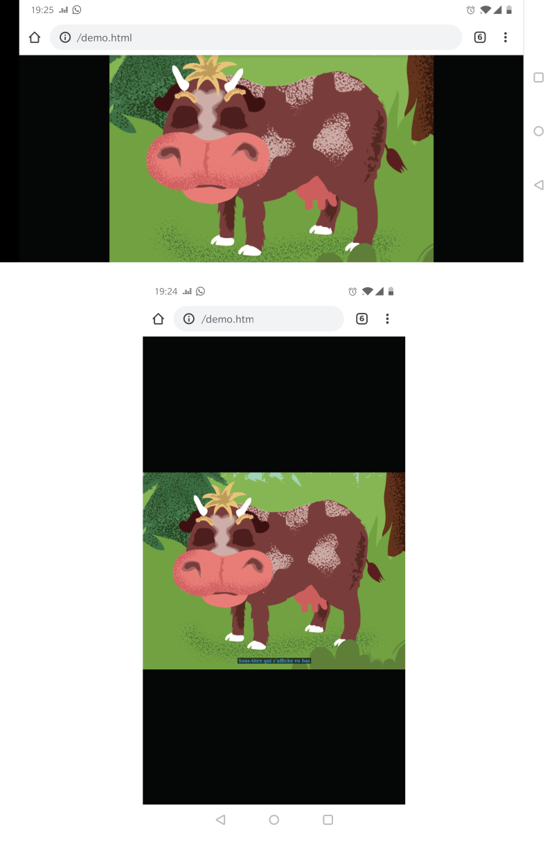
Je souhaite que le container principal de ma page web soit toujours centré (vertical et horizontal) et le rapport largeur/hauteur soit égal à 4/3.
Le container doit s'étaler au maximum sans apparition d’ascenseur de scrolling.
Selon la valeur du rapport largeur/hauteur une marge s'affiche à droite et gauche, ou en haut et en bas.
Pour Chrome Android, le bas du container est tronqué. C'est surement dû à la barre d'URL.
Je ne rencontre pas ce problème sur PC Chrome.
https://www.zupimages.net/up/20/18/4xaf.png
Est-ce qu'il y a une meilleur solution afin d'éviter ce problème ?
Merci pour votre aide !
Html :
Css:
Modifié par mindif (28 Apr 2020 - 20:27)
Je souhaite que le container principal de ma page web soit toujours centré (vertical et horizontal) et le rapport largeur/hauteur soit égal à 4/3.
Le container doit s'étaler au maximum sans apparition d’ascenseur de scrolling.
Selon la valeur du rapport largeur/hauteur une marge s'affiche à droite et gauche, ou en haut et en bas.
Pour Chrome Android, le bas du container est tronqué. C'est surement dû à la barre d'URL.
Je ne rencontre pas ce problème sur PC Chrome.
https://www.zupimages.net/up/20/18/4xaf.png
Est-ce qu'il y a une meilleur solution afin d'éviter ce problème ?
Merci pour votre aide !
Html :
<body  >
<div id=container >
<img id="imgmain1"  src="demo.png"  >
<div id="tag"><span class="tag">Sous-titre qui s'affiche en bas</span></div>
</div>
</body>
Css:
body
{
	background-color:#050707;
	margin:0;
	padding:0;
	overflow:hidden;

}

#container{
    width: 100vw;
    height: 75vw; /* height:width ratio = 3/4 = .75  */
    max-height: 100vh;
    max-width: 133.33vh; /* 4/3 = 1.33333 */
    margin: auto;
    position: absolute;
    top:0;
	bottom:0;
    left:0;
	right:0;
	overflow:hidden;
}

#container2 {
	position: relative;
	width:100%;
	height:100%;
}

#tag {
	z-index: 1000;
    position: absolute;
	bottom:3%;
    text-align:center;
	margin-bottom:0em;
	width:100%;
}

.tag {
	z-index: 1000;
	padding-right:0.4vw;
	padding-left:0.4vw;
	color: #419AEA;
	font-weight: bold;
	font-size:18px	;
	background-color:rgba(5, 7, 7, 0.7);
	text-align:center;
}


#imgmain1 {
	top:0px;
	position: absolute;
	z-index:10;
	width:100%;
	height:100%;
}
Modifié par mindif (28 Apr 2020 - 20:27)