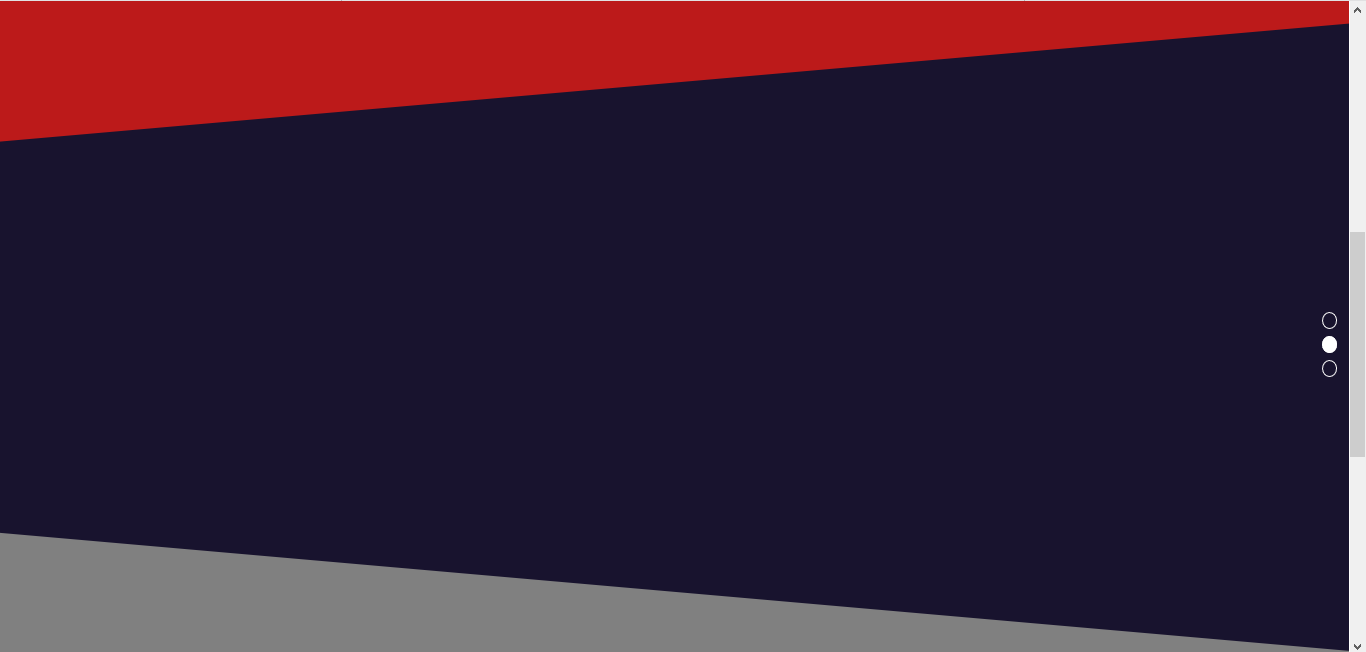
Bonjour, j'ai réalisé un site dont le background est composé de div "penchés" (voir image). Quand je zoom ou dezoom, le background ne bouge pas, mais c'est quand je redimensionne la fenêtre que certains div se déplace ( je pense que c'est à cause des margin négatif + les z-index). Auriez-vous des piste pour résoudre ce problème ? Merci.
L'image :
Le code HTML :
Le code CSS :
L'image :
Le code HTML :
<!DOCTYPE html>
<html lang="fr">
<head>
<title>Titre</title>
<link rel="shortcut icon" href="logo.ico">
<link rel="stylesheet" type="text/css" href="style.css">
</head>
<body>
<header>
<h1>LOGO</h1>
<nav>
<input type="checkbox" id="toggle">
<label for="toggle">☰</label>
<ul class="menu">
<li><a href="#">Accueil</a></li>
<li class="stylemenu"><a href="#">Services</a></li>
<li class="stylemenu"><a href="#">A propos</a></li>
<li class="stylemenu"><a href="#">Contact</a></li>
</ul>
</nav>
</header>
<div class="barre">
<ul>
<li><a href="#one" id="p1"></a></li>
<li><a href="#two" id="p2"></a></li>
<li><a href="#three" id="p3"></a></li>
</ul>
</div>
<script type="text/javascript">
window.onscroll = function() {myFunction()};
function myFunction() {
var Position = document.getElementById("one").offsetTop;
var Position1 = document.getElementById("two").offsetTop;
var Position2 = document.getElementById("three").offsetTop;
var x = document.body.scrollTop || document.documentElement.scrollTop;
if (x >= ((Position1+Position2)/2)){
document.getElementById("p3").style.backgroundColor = "white";
document.getElementById("p3").style.transition = "0.8s";
document.getElementById("p2").style.backgroundColor = "transparent";
document.getElementById("p1").style.backgroundColor = "transparent";
}else if (x >= ((Position1+Position)/2) && x<((Position1+Position2)/2)){
document.getElementById("p2").style.backgroundColor = "white";
document.getElementById("p2").style.transition = "0.8s";
document.getElementById("p3").style.backgroundColor = "transparent";
document.getElementById("p1").style.backgroundColor = "transparent";
}else if (x < ((Position1+Position)/2)){
document.getElementById("p1").style.backgroundColor = "white";
document.getElementById("p1").style.transition = "0.8s";
document.getElementById("p3").style.backgroundColor = "transparent";
document.getElementById("p2").style.backgroundColor = "transparent";
}
}
</script>
<div class="rouge" id="one">
</div>
<div class="bleu" id="two">
<div class="bleu_haut"></div>
</div>
<div class="gris" id="three">
<div class="gris_haut"></div>
</div>
</body>
</html>
Le code CSS :
html{
	scroll-behavior : smooth;
}
*{
	margin: 0;
	padding: 0;
	font-family: 'Ailerons', sans-serif;

}
header{
	text-align: center;
	z-index: 99;
	width: 100%;
	background-color: #18132E;
	box-shadow: 2px 2px 5px black;


}
h1{
	display: inline-block;
}
.barre{
	z-index: 99999;
	margin:35vh 0 0 98%;
	display: inline-block;
	position: fixed;
}


.barre>ul>li{
	list-style:none;
	margin-top: 10px;
}
.barre>ul>li>a{
	padding: 0px 8px;
	border:solid 1px white;
	border-radius: 100%;
}
.stylemenu{
	border-left: solid 1px white;
}
a > .logo{
	display: inline-block;
	height: 86px;
	width: 200px;
	margin-left: 15px;
	background: url(titre.png);
	background-repeat: no-repeat;


}
a >.logo:hover{
	background:url(titrehover.png);
	background-repeat: no-repeat;
	transition: 2s;
}
nav >.menu{
	margin-top:10px;
	padding: 10px;
	display: inline-block;

}
nav{
	width: 700px;
	margin: 15px auto;
	display: inline-block;
	vertical-align: top;
}
nav > li{
	color: white;
}
nav > ul > li{
	display: inline-block;
}
nav > ul > li > a{
	font-size: 24px;
	padding: 5px 30px;
	color: white;
	text-decoration: none;
}
nav > ul > li > a:hover{
	color: #BC1A1A;
	transition:1s;

}
label{
	font-size: 40px;
	line-height: 70px;
	color: white;
	display: none;
}
#toggle{
	display: none;
}
@media screen and (max-width: 880px){
	.barre{
		float: right;
	}
}

@media screen and (max-width: 990px){
	a > .logo{
		width: 250px;
		margin-left:auto;
		margin-right:auto;
	}

	label{
		margin-left:5%;
		display: inline-block;
		cursor: pointer;
	}
	label:hover{
		transition-duration: 1s;
		color: #D11720;
		transform: rotate(180deg);
	}
	nav{
		width: 50px;
		float: right;
	}

	nav >.menu{
		margin:0;
		text-align: left;
		display: none;
	}
	nav > ul > li > a:hover{
		border-bottom: none;
	}
	nav > ul > li{
		margin: 0;
		display: block;
	}
	nav > ul > li > a{
		font-size: 16px;

	}
	nav input[type=checkbox]:checked ~ .menu{
		display: block;
	}

}
.rouge{
	z-index: -2;
	overflow: hidden;
	height: 100vh;
	width: 100%;
	background-color: #BC1A1A;

}
.bleu{
	margin-top:-10%;
	overflow: hidden;
	height: 105vh;
	width: 100%;
	clear: both;

}
.bleu_haut{
	z-index: 1;
	margin-top: 2%;
	margin-left: -10%;
	width: 200%;
	height: 200%;
	background-color: #18132E;
	transform: rotate(-5deg);

}
.bleu_haut>p{
	z-index: 9999;
	padding-top:10%;
	margin-left: 30%;
	transform: rotate(5deg);
}
.gris{
	margin-top:-20%;
	overflow: hidden;
	height: 110vh;
	width: 100%;
}
.gris_haut{
	z-index: 4;
	margin-top: 15%;
	margin-left: -20%;
	width: 200%;
	height: 200%;
	background-color: grey;
	transform: rotate(5deg);

}