Bonjour à tous,
Je suis débutant et j'ai réalisé cette petite grille qui fonctionne presque comme je souhaite
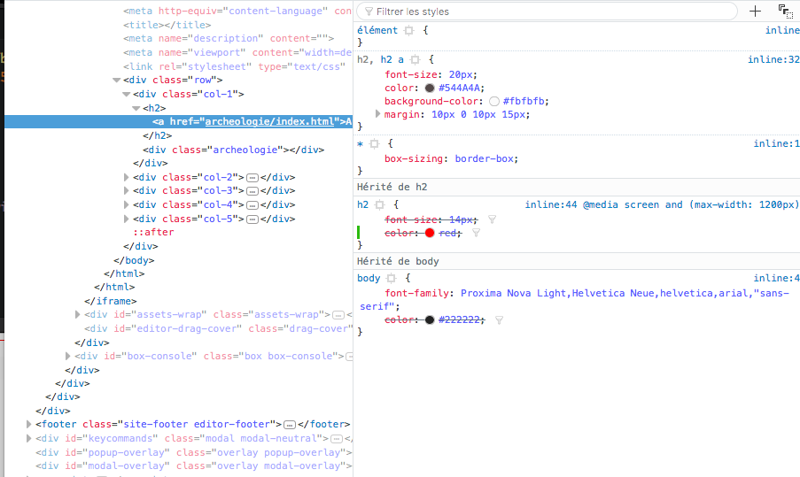
je ne comprends pas pourquoi la règle media queries ne fonctionne pas.....
Voici le code html :
et voici la css
Merci par avance pour votre aide
Je suis débutant et j'ai réalisé cette petite grille qui fonctionne presque comme je souhaite
je ne comprends pas pourquoi la règle media queries ne fonctionne pas.....
Voici le code html :
<!DOCTYPE html>
<html lang="fr">
<head>
<meta charset="utf-8">
<meta http-equiv="content-language" content="fr" />
<title></title>
<meta name="description" content="" />
<meta name="viewport" content="width=device-width, initial-scale=1.0, maximum-scale=1.0">
<link rel="stylesheet" type="text/css" href="css/home.css" />
</head>
<body>
<div class="row">
<div class="col-1"><h2><a href="archeologie/index.html">Archéologie, art islamique et d'Asie</a></h2><div class="archeologie"></div></div>
<div class="col-2"><h2><a href="deco/index.html">Art décoratif</a></h2><div class="deco"></div></div>
<div class="col-3"><h2><a href="art-premier/index.html">Art Premier</a></h2><div class="art-premier"></div></div>
<div class="col-4"><h2><a href="mobilier/index.html">Mobilier</a></h2><div class="mobilier"></div></div>
<div class="col-5"><h2><a href="mode/index.html">Mode et beauté</a></h2><div class="mode"></div></div>
</div>
</body>
</html>
et voici la css
* {
    border:0;
    padding:0;
	margin:0;
}

* {
    box-sizing: border-box;
}
body {
	font-family: Proxima Nova Light,Helvetica Neue,helvetica,arial,"sans-serif";
    color:#222222;
}
.archeologie  { background:url('img/archeologie.jpg') no-repeat; height:360px; background-position: center;}
.deco  { background:url('img/art.jpg') no-repeat; height:360px; background-position: center;}
.art-premier  { background:url('img/art-premier.jpg') no-repeat; height:360px; background-position: center;}
.mobilier  { background:url('img/mobilier.jpg') no-repeat; height:360px; background-position: center;}
.mode  { background:url('img/mode.jpg') no-repeat; height:360px; background-position: center;}

.col-1 {width: 33.33%;}
.col-2 {width: 33.33%;}
.col-3 {width: 33.33%;}
.col-4 {width: 33.33%;}
.col-5 {width: 33.33%;}

[class*="col-"] {
    float: left;
    padding: 8px;
    border: 1px solid red;
}

.row::after {
    content: "";
    clear: both;
    display: table;
}

h2, h2 a {
    font-size: 20px;
	color:#544A4A;
    background-color: #fbfbfb;
    margin:10px 0 10px 15px;
}

h2 a:hover {
    color: #C2A661;
}

@media screen and (max-width: 1200px) {
	h2 {
		font-size: 14px;
	}
}
Merci par avance pour votre aide