Bonjour,
Je suis en train de constuire mon site grâce à Skeleton, (http://getskeleton.com/)
Pour le responsive iphone vers 15 pouces, ce module s'avère assez efficace.
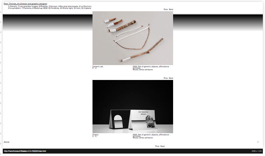
Par contre, quand je fais une simulation avec une résolution d'écran plus grande (27 pouces),
je me retrouve avec une colonne au centre qui flotte..
https://s3-eu-west-1.amazonaws.com/sdz-upload/prod/upload/Capture%20d%E2%80%99%C3%A9cran%202015-07-12%20%C3%A0%2018.44.35.png
Je pense que cela est dû au fait que Skeleton soit construit en 960px, et sur une résolution de 2560x1440px (27 pouces), il ne se passe rien.
Du coup j'aimerais avoir un changement de ce type, que la colonne seule accueille deux projets :
https://s3-eu-west-1.amazonaws.com/sdz-upload/prod/upload/Capture%20d%E2%80%99%C3%A9cran%202015-07-12%20%C3%A0%2018.47.42.png
Je vous remercie par avance,
marc
Modifié par marccc (12 Jul 2015 - 22:20)
Je suis en train de constuire mon site grâce à Skeleton, (http://getskeleton.com/)
Pour le responsive iphone vers 15 pouces, ce module s'avère assez efficace.
Par contre, quand je fais une simulation avec une résolution d'écran plus grande (27 pouces),
je me retrouve avec une colonne au centre qui flotte..
https://s3-eu-west-1.amazonaws.com/sdz-upload/prod/upload/Capture%20d%E2%80%99%C3%A9cran%202015-07-12%20%C3%A0%2018.44.35.png
Je pense que cela est dû au fait que Skeleton soit construit en 960px, et sur une résolution de 2560x1440px (27 pouces), il ne se passe rien.
Du coup j'aimerais avoir un changement de ce type, que la colonne seule accueille deux projets :
https://s3-eu-west-1.amazonaws.com/sdz-upload/prod/upload/Capture%20d%E2%80%99%C3%A9cran%202015-07-12%20%C3%A0%2018.47.42.png
/* Larger than Desktop HD */
@media (min-width: 1200px) {}
/* Grid
–––––––––––––––––––––––––––––––––––––––––––––––––– */
.container {
position: relative;
width: 100%;
max-width: 960px;
margin: 0 auto;
padding: 0 20px;
box-sizing: border-box; }
.column,
.columns {
width: 100%;
float: left;
box-sizing: border-box; }
/* For devices larger than 400px */
@media (min-width: 400px) {
.container {
width: 85%;
padding: 0; }
}
/* For devices larger than 550px */
@media (min-width: 550px) {
.container {
width: 80%; }
.column,
.columns {
margin-left: 4%; }
.column:first-child,
.columns:first-child {
margin-left: 0; }
.one.column,
.one.columns { width: 4.66666666667%; }
.two.columns { width: 13.3333333333%; }
.three.columns { width: 22%; }
.four.columns { width: 30.6666666667%; }
.five.columns { width: 39.3333333333%; }
.six.columns { width: 48%; }
.seven.columns { width: 56.6666666667%; }
.eight.columns { width: 65.3333333333%; }
.nine.columns { width: 74.0%; }
.ten.columns { width: 82.6666666667%; }
.eleven.columns { width: 91.3333333333%; }
.twelve.columns { width: 100%; margin-left: 0; }
.one-third.column { width: 30.6666666667%; }
.two-thirds.column { width: 65.3333333333%; }
.one-half.column { width: 48%; }
/* Offsets */
.offset-by-one.column,
.offset-by-one.columns { margin-left: 8.66666666667%; }
.offset-by-two.column,
.offset-by-two.columns { margin-left: 17.3333333333%; }
.offset-by-three.column,
.offset-by-three.columns { margin-left: 26%; }
.offset-by-four.column,
.offset-by-four.columns { margin-left: 34.6666666667%; }
.offset-by-five.column,
.offset-by-five.columns { margin-left: 43.3333333333%; }
.offset-by-six.column,
.offset-by-six.columns { margin-left: 52%; }
.offset-by-seven.column,
.offset-by-seven.columns { margin-left: 60.6666666667%; }
.offset-by-eight.column,
.offset-by-eight.columns { margin-left: 69.3333333333%; }
.offset-by-nine.column,
.offset-by-nine.columns { margin-left: 78.0%; }
.offset-by-ten.column,
.offset-by-ten.columns { margin-left: 86.6666666667%; }
.offset-by-eleven.column,
.offset-by-eleven.columns { margin-left: 95.3333333333%; }
.offset-by-one-third.column,
.offset-by-one-third.columns { margin-left: 34.6666666667%; }
.offset-by-two-thirds.column,
.offset-by-two-thirds.columns { margin-left: 69.3333333333%; }
.offset-by-one-half.column,
.offset-by-one-half.columns { margin-left: 52%; }
}Je vous remercie par avance,
marc
Modifié par marccc (12 Jul 2015 - 22:20)