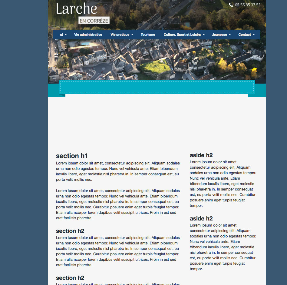
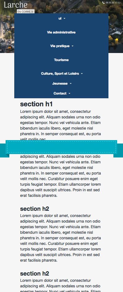
Salut je suis nouveau sur le forum, j'ai un petit problème, j'ai incorporé un ruban css sur mon site responsive, en fenêtre full size pas de problème mais dés que je réduis la taille de la fenêtre, le ruban se déplace comme "poussé" par mon menue. Je voudrais qu'en fenêtre low size mon menu passe par dessus le ruban et que ce ruban reste à une position fixe . Merci d'avance
<!doctype html>
<!--[if lt IE 7 ]> <html lang="en" class="no-js ie6"> <![endif]-->
<!--[if IE 7 ]>    <html lang="en" class="no-js ie7"> <![endif]-->
<!--[if IE 8 ]>    <html lang="en" class="no-js ie8"> <![endif]-->
<!--[if IE 9 ]>    <html lang="en" class="no-js ie9"> <![endif]-->
<!--[if (gt IE 9)|!(IE)]><!--> <html lang="en" class="no-js"> <!--<![endif]-->
<head>
  <meta charset="utf-8">
  <meta name="viewport" content="width=device-width">

  <title>Larche</title>

  <link rel="shortcut icon" href="/favicon.ico">
 	<link rel="stylesheet" href="style.css">
  <script src="http://ajax.googleapis.com/ajax/libs/jquery/1/jquery.min.js"></script>
  <script src="http://cdnjs.cloudflare.com/ajax/libs/modernizr/2.5.3/modernizr.min.js"></script>

</head>

<body class="cf">

  <header class="span12">
  	<div class="inner cf">

<nav id="ddmenu">

    <ul>
        <li class="full-width">
            <span class="top-heading">ui</span>
            <i class="caret"></i>

        </li>
        <li class="no-sub"><a class="top-heading" href="">Vie administrative</a></li>

        <li>
            <span class="top-heading">Vie pratique</span>
            <i class="caret"></i>

        </li>
        <li class="no-sub">
            <a class="top-heading" href="#">Tourisme</a>
        </li>
        <li>
            <span class="top-heading">Culture, Sport et Loisirs</span>
            <i class="caret"></i>

        </li>
          <li>
            <span class="top-heading">Jeunesse</span>
            <i class="caret"></i>

        </li>
          <li>
            <span class="top-heading">Contact</span>
            <i class="caret"></i>

        </li>

    </ul>
</nav>
	</div>
<!-- RUBAN -->
<div class="container one">

  <div class="bk l">
    <div class="arrow top"></div>
    <div class="arrow bottom"></div>
  </div>

  <div class="skew l"></div>

  <div class="main">
    <div></div>
  </div>

  <div class="skew r"></div>

  <div class="bk r">
    <div class="arrow top"></div>
    <div class="arrow bottom"></div>
  </div>

</div>
<!--FINRUBAN -->
  </header>

  <div id="container" class="cf">

  	<article class="span8">
				<section>
          <h1>section h1</h1>
          <p>Lorem ipsum dolor sit amet, consectetur adipiscing elit. Aliquam sodales urna non odio egestas tempor. Nunc vel vehicula ante. Etiam bibendum iaculis libero, eget molestie nisl pharetra in. In semper consequat est, eu porta velit mollis nec.</p>

          <p>Lorem ipsum dolor sit amet, consectetur adipiscing elit. Aliquam sodales urna non odio egestas tempor. Nunc vel vehicula ante. Etiam bibendum iaculis libero, eget molestie nisl pharetra in. In semper consequat est, eu porta velit mollis nec. Curabitur posuere enim eget turpis feugiat tempor. Etiam ullamcorper lorem dapibus velit suscipit ultrices. Proin in est sed erat facilisis pharetra.</p>
        </section>
        <section>
          <h2>section h2</h2>
          <p>Lorem ipsum dolor sit amet, consectetur adipiscing elit. Aliquam sodales urna non odio egestas tempor. Nunc vel vehicula ante. Etiam bibendum iaculis libero, eget molestie nisl pharetra in. In semper consequat est, eu porta velit mollis nec. Curabitur posuere enim eget turpis feugiat tempor.</p>
        </section>
			</article>

			<aside class="span4 col">
					<h2>aside h2</h2>
          <p>Lorem ipsum dolor sit amet, consectetur adipiscing elit. Aliquam sodales urna non odio egestas tempor. Nunc vel vehicula ante. Etiam bibendum iaculis libero, eget molestie nisl pharetra in. In semper consequat est, eu porta velit mollis nec. Curabitur posuere enim eget turpis feugiat tempor.</p>

          <h2>aside h2</h2>
          <p>Lorem ipsum dolor sit amet, consectetur adipiscing elit. Aliquam sodales urna non odio egestas tempor. Nunc vel vehicula ante. Etiam bibendum iaculis libero, eget molestie nisl pharetra in. In semper consequat est, eu porta velit mollis nec. Curabitur posuere enim eget turpis feugiat tempor.</p>
			</aside>

  </div> <!--! end of #container -->

  <footer>

  </footer>

</body>
</html>
html, body, div, span, object, iframe,
h1, h2, h3, h4, h5, h6, p, blockquote, pre,
abbr, address, cite, code,
del, dfn, em, img, ins, kbd, q, samp,
small, strong, sub, sup, var,
b, i,
dl, dt, dd, ol, ul, li,
fieldset, form, label, legend,
table, caption, tbody, tfoot, thead, tr, th, td,
article, aside, canvas, details, figcaption, figure,
footer, header, hgroup, menu, nav, section, summary,
time, mark, audio, video {
margin:0;
padding:0;
border:0;
outline:0;
font-size:100%;
vertical-align:baseline;
background:transparent;
}
article, aside, details, figcaption, figure,
footer, header, hgroup, menu, nav, section {
display:block;
}
nav ul, nav li { margin: 0; }
nav ul, ul { list-style:none; }
.span1, .span2, .span3, .span4, .span5, .span6, .span7, .span8, .span9, .span10, .span11, .span12{
float:left;
-webkit-box-sizing:border-box;
-moz-box-sizing:border-box;
box-sizing:border-box;
}
.col{
margin-left: 1.5%;
}
.col:first-child {
margin-left:0;
}
.span1{
width: 6.95833333333%;
}
.span2{
width: 15.4166666667%;
}
.span3{
width: 23.875%;
}
.span4{
width: 32.3333333333%;
}
.span5{
width: 40.7916666667%;
}
.span6{
width: 49.25%;
}
.span7{
width: 57.7083333333%;
}
.span8{
width: 66.1666666667%;
}
.span9{
width: 74.625%;
}
.span10{
width: 83.0833333333%;
}
.span11{
width: 91.5416666667%;
}
.span12{
width: 100%;
margin-left: 0;
}
body{
font-size: 87.5%;
color: #252e35;
font-family: 'Helvetica Neue', Helvetica, Arial, sans-serif;
line-height: 1.5em;
background: #f6f6f6;
margin-left: auto;
margin-right: auto;
max-width: 800px;
}
html {
background-color:#3a5970;
background-image: radial-gradient(#37a3e8 20%, transparent 1%),
radial-gradient(#37a3e8 20%, transparent 1%);
background-size: 5px 5px;
background-position: 0 0, 30px 30px;
}
h1{
font-size: 1.714285714em; /* 24 / 14 */
line-height: 1.5em; /* 21 / 14 */
}
h2{
font-size: 1.5em; /* 21 / 14 */
line-height: 1.5em; /* 21 / 14 */
}
p{
font-size: 1em; /* 14 / 14 */
line-height: 1.5em; /* 21 / 14 */
margin-bottom: 1.5em; /* 21 / 14 */
}
#container, .inner{
margin: 0 auto;
}
header{
background-image: url(img/vueair.png);
height: 357px;
width: 100%;
background-repeat: no-repeat;
background-size: contain;
}
section {
margin-left: 30px;
margin-right: 20px;
}
aside {
}
#container{
clear: both;
padding-top: 200px;
padding-right: 30px;
}
.alt{
color: #fff;
color: rgba(255,255,255, 0.9);
letter-spacing: 0.05em;
}
/*RUBAN*/
* {
box-sizing: border-box;
}
.container {
width: 100%;
max-width: 1000px;
height: 80px;
margin: 150px auto;
position: relative;
z-index: 3;
}
.one > div {
height: 50px;
}
.main {
background: #0fadc0;
position: relative;
display: block;
width: 90%;
left: 50%;
top: 0;
padding: 5px;
margin-left: -45%;
z-index: 10;
}
.main > div {
border: 1px dashed #fff;
border-color: rgba(255, 255, 255, 0.5);
height: 40px;
}
.bk {
background: #1199a9;
position: absolute;
width: 8%;
top: 12px;
}
.bk.l {
left: 0;
}
.bk.r {
right: 0;
}
.skew {
position: absolute;
background: #0c7582;
width: 3%;
top: 6px;
}
.skew.l {
left: 5%;
transform: skew(00deg,20deg);
}
.skew.r {
right: 5%;
transform: skew(00deg,-20deg);
}
.bk.l > div {
left: -30px;
}
.bk.r > div {
right: -30px;
}
@media all and (max-width: 1020px) {
.skew.l {
left: 5%;
transform: skew(00deg,25deg);
}
.skew.r {
right: 5%;
transform: skew(00deg,-25deg);
}
}
@media all and (max-width: 680px) {
.skew.l {
left: 5%;
transform: skew(00deg,30deg);
}
.skew.r {
right: 5%;
transform: skew(00deg,-30deg);
}
}
@media all and (max-width: 460px) {
.skew.l {
left: 5%;
transform: skew(00deg,40deg);
}
.skew.r {
right: 5%;
transform: skew(00deg,-40deg);
}
}
/* NAVIGATION */
/* main menu
----------------------------*/
#ddmenu
{
display:block;
font-family: "Helvetica Neue", Helvetica, Arial, sans-serif;
text-align:center; /*Specify the alignment of the whole UL if UL is not width:100%;*/
letter-spacing:normal;
margin-top: 14%;
}
#ddmenu ul
{
margin:0 auto;
padding:0px 0px 0px 0px;
text-align:center; /* Alignment of each top-level menu items within the UL */
width:95%;
font-size:0;
background:#1C456E;
display:inline-block;
list-style:none;
position:relative;
z-index:999999990;
max-width:800px;
}
#ddmenu li
{
margin:0;
padding:0;
font-size:12px;
display:inline-block;
*display:inline;
zoom:1; /*for IE6-7*/
position:relative;
color:#eee;
line-height:36px; /*This determines the height of the menu*/
vertical-align:middle;
transition:background-color 0.2s;
outline:none;
-moz-user-select:none;
-webkit-user-select: none;
-ms-user-select: none;
}
#ddmenu .full-width {
position: static;
}
#ddmenu .over
{
color:#FFF;
background-color:#205081;
}
#ddmenu .over.no-sub {
}
#ddmenu .top-heading
{
font-weight:bold;
margin:0 16px;
color:inherit;
text-decoration:none;
display:inline-block;
outline:0;
cursor:pointer;
}
/* links of top-heading */
#ddmenu a, #ddmenu a:link, #ddmenu a:hover
{
color:inherit;
}
#ddmenu a:hover
{
text-decoration:underline;
}
#ddmenu a:focus
{
outline:1px dotted #09F;
}
/* caret(arrow icon) */
#ddmenu .caret
{
color:inherit;
left:-12px;
width: 0;
height: 0;
overflow:hidden;/*for IE6*/
vertical-align:middle;
margin-bottom:2px;
border-top: 4px solid;/*caret size is 4px now*/
border-right: 4px solid transparent;
border-left: 4px solid transparent;
display: inline-block;
position:relative;
}
/* MEDIA QUERIES */
/* Responsify Defaults */
@media screen and (max-width: 768px){
nav .span4{
width: 100%;
}
.span8, article{
width: 100%;
}
.span4, aside{
width: 100%;
margin-left: 0;
}
#container, .inner{
width: 90%;
padding: 0 5% 0 5%;
}
}
@media screen and (max-width: 480px){
nav ul li{
width: 100%;
margin: 0 0 5px 0;
}
nav a{
margin: 0;
padding: 14px 0 14px 0;
}
}
/* Custom Breakpoints */
@media screen and (max-width: px) {
/* Add your styles for devices with a maximum width of */
}
/* Micro Clearfix */
/* For modern browsers */
.cf:before,
.cf:after {
content:"";
display:table;
}
.cf:after {
clear:both;
}
/* For IE 6/7 (trigger hasLayout) */
.cf {
*zoom:1;
}
