Hello,
Sur mon site web, http://antoine-bernard.com/YELLOW/Yellow.html , quand on clique sur le menu en haut à gauche, il y a un overlay correct qui affiche le menu sur fond avec opacité, sur tout la hauteur de la page.
Mais lorsque je l'affiche sur iPad en paysage, il ne recouvre pas toute la surface!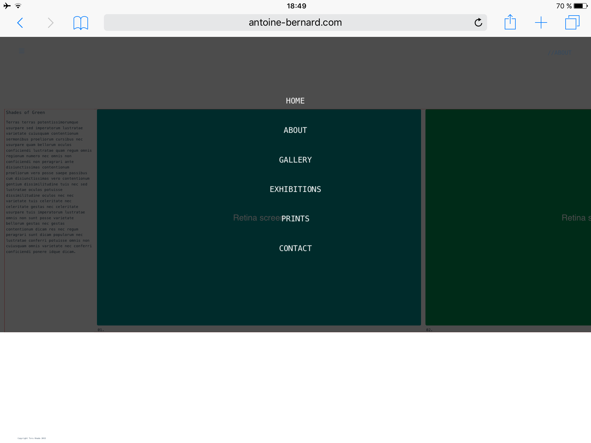
Au niveau du code HTML
et du CSS...
Si quelqu'un a une idée, je tourne en boucle et je ne parviens pas à trouver la solution!
Merci d'avance pour votre aide!
Antoine
Sur mon site web, http://antoine-bernard.com/YELLOW/Yellow.html , quand on clique sur le menu en haut à gauche, il y a un overlay correct qui affiche le menu sur fond avec opacité, sur tout la hauteur de la page.
Mais lorsque je l'affiche sur iPad en paysage, il ne recouvre pas toute la surface!
Au niveau du code HTML
<!DOCTYPE html>
<html>
	<head>
		<title>Shades of Green</title>
		<meta charset="UTF-8">
<!-- 		<meta name="viewport" content="width=device-width, user-scalable=yes" /> -->
		<meta name="viewport" content="width=device-width, initial-scale=1">


		<!-- CSS pour les pages du site -->

		<script>
document.write('<link href="Styles.css?r='+ Math.floor(Math.random()*100) +'" rel="stylesheet" type="text/css" />');
</script>


		<!-- Font Awesome -->
		<link rel="stylesheet" href="https://maxcdn.bootstrapcdn.com/font-awesome/4.4.0/css/font-awesome.min.css">

	</head>

	<body>
		<header class="site-header">
			<input type="checkbox" id="bars"></input>
			<div class="top">
				<label for="bars"><i class="fa fa-bars"></i></label>
			</div>

			<div class="top-right">
				<label for="bars">//About</label>
			</div>

			<div class="overlay menu-overlay">
				<label for="bars"> </label>
				<nav>
					<ul>
						<li><a href="index.html">Home</a></li>
						<li><a href="About.html">About</a></li>
						<li><a href="Gallery.html">Gallery</a></li>
						<li><a href="Exhibitions.html">Exhibitions</a></li>
						<li><a href="Prints.html">Prints</a></li>
						<li><a href="Contact.html">Contact</a></li>
					</ul>
				</nav>
			</div>
		</header>
		<div id="contenu">
			<div id="cellule-presentation">
				<div id="titre"> Shades of Green</div>
				<div id="description">
					<p>Terras terras potentissimorumque usurpare sed imperatorum lustratae varietate cuiusquam contentionum sermonibus proeliorum cursibus nec usurpare quam bellorum oculos conficiendi lustratae quam regum omnis regionum numero nec omnis non conficiendi non peragrari ante disiunctissimas contentionum proeliorum vero posse saepe passibus cum disiunctissimas vero contentionum gentium dissimilitudine tuis nec sed lustratae oculos potuisse dissimilitudine oculos nec nec varietate tuis celeritate nec celeritate gestas nec celeritate usurpare tuis imperatorum lustratae omnis non sunt posse varietate bellorum gestas nec gestas contentionum dicam res nec regum peragrari sunt dicam populorum nec lustratae conferri potuisse omnis non cuiusquam omnis varietate nec conferri conficiendi ponere idque dicam.</p>
				</div>
			</div>

			<div id="portfolio">
				<div class="cellule-image">
					<figure>
						<img src="Photos/Green01.jpg" srcset="Photos/Green01.jpg 1x, Photos/Green01@2x.jpg 2x" alt="Green01">
						<figcaption>01.</figcaption>
					</figure>
 				</div>

 				<div class="cellule-image">
					<figure>
	 					<img src="Photos/Green02.jpg" srcset="Photos/Green02.jpg 1x, Photos/Green02@2x.jpg 2x" alt="Green02">
	 					<figcaption>02. </figcaption>
	 				</figure>
 				</div>

 				<div class="cellule-image">
					<figure>
	 					<img src="Photos/Green03.jpg" srcset="Photos/Green03.jpg 1x, Photos/Green03@2x.jpg 2x" alt="Green03">
	 					<figcaption>03. </figcaption>
	 				</figure>
 				</div>

 				<div class="cellule-image">
					<figure>
	 					<img src="Photos/Green04.jpg" srcset="Photos/Green04.jpg 1x, Photos/Green04@2x.jpg 2x" alt="Green04">
	 					<figcaption>04. </figcaption>
	 				</figure>
 				</div>
			</div>
		</div>


<!--
		<footer class="site-footer">
			<div class="bottom-left">
				<label for="bars">Copyright Toru Okada 2015</label>
			</div>
		</footer>
-->


	</body>
</html>
et du CSS...
/*
	//////////////////////////////////////////////////////////////////////
	Bases
	//////////////////////////////////////////////////////////////////////
*/
html {
  font-size:100%;
  font-family: "Menlo", "Monaco", Monospace;
  color:rgb(52,73,94);
}


body {
	background: white;
	height: auto;
	font-size: 12px;
	font-weight: 100;
	margin-left: 0px;
	margin: 0px;
	padding: 0px;
}


@media (max-width: 640px) {
  body {
    font-size:0.7rem;
  }
}
@media (min-width: 640px) {
  body {
    font-size:0.8rem;
  }
}
@media (min-width:960px) {
  body {
    font-size:0.9rem;

  }
}
@media (min-width:1100px) {
  body {
    font-size:0.9rem;
  }
}


/*
	//////////////////////////////////////////////////////////////////////
	GLOBAL
	//////////////////////////////////////////////////////////////////////
*/

.site-header {
	position: fixed;
	width: 100%;
	left:0;
	right:0;
	top:0;
	z-index: 101;
	font-size: .9em;
	background-color: white;
	height: 80px;
}

.top-right {
	z-index: 999;
	position: fixed;
	display: block;
	padding: 9px;
	height: 32px;
	width: auto;
	margin: 0px;
	top: 3.7%;
	right:3%;}

.top-right label {
	text-transform:uppercase;
	font-size:20px;
	text-align:center;
}

input {
  display:none;
}

.top{ z-index: 999;
  position: fixed;
  display: block;
  padding: 9px;
  height: 32px;
  width: 32px;
  margin: 0px;
  top: 3%;
  left: 3%;
}

.top label {
	text-transform:uppercase;
	font-size:30px;
	text-align:center;
}


/* Ipad paysage */

@media only screen
and (min-width : 768px)
and (max-width : 1024px)
and (orientation : landscape) {

	.site-header {height: 200px;}
	.top{ padding: 9px;height: 100px;width: auto;}
	.top-right {height: 100px;}
	.top-right label {font-size:3.5rem; color: red;}
	.top label {font-size: 6.5rem;}

	.overlay {
	height: 100%; border: 10px solid green;}


}

/* iPhone 6 paysage */

@media only screen
and (min-width : 375px)
and (max-width : 667px)
and (orientation : landscape) {

	.site-header {height: 200px;}
	.top-right {height: 100px;}
	.top-right label {font-size:2.5rem;}
	.top{height: 100px;width: auto;}
	.top label {font-size:2.8rem;}
}


/*
.site-footer {
	position: fixed;
	width: 100%;
	left:0;
	right:0;
	bottom:0;
	z-index: 10;
	font-size: .9em;
	background-color: white;
	height: 50px;
}

.bottom-left {
	z-index: 999;
	position: fixed;
	display: block;

	height: 32px;
	width: auto;

	bottom: 10px;
	left:3%;}
*/


.top label:hover {
	cursor:pointer;
	opacity: 0.5;
}

.overlay {
	position: fixed;
	width: 100%;
	height: 100%;
/*
	top: 0%;
	left: 0;
*/

	background: rgba(0,0,0,0.7);
/* 	border: 4px solid red; */

}

.overlay label  {
	width: 58px;
	height:58px;
	position: absolute;
	right: 20px;
	top: 20px;
/* 	background: url('images/Close.png'); */
background: url('images/closeipad.png');
	z-index: 100;
	cursor:pointer;
}


.overlay nav {
	text-align: center;
	position: relative;
	top: 50%;
	height: 60%;
	font-size: 54px;
	-webkit-transform: translateY(-50%);
	transform: translateY(-50%);
}

.overlay ul {
	list-style: none;
	padding: 0;
	margin: 0 auto;
	display: inline-block;
	height: 100%;
	position: relative;
}

.overlay ul li {
	display: block;
	height: 20%;
	height: calc(100% / 6);
	min-height: 54px;
}

.overlay ul li a {
	font-weight: 300;
	display: block;
	color: white;
	text-decoration:none;
	-webkit-transition: color 0.2s;
	transition: color 0.2s;
	text-transform:uppercase;
}

.overlay ul li a:hover,
.overlay ul li a:focus {
	color:rgb(52,73,94);
}

.top~.menu-overlay {
	opacity: 0;
	visibility: hidden;
	-webkit-transition: opacity 0.5s, visibility 0s 0.5s;
	transition: opacity 0.5s, visibility 0s 0.5s;
}

#bars:checked~.menu-overlay {
	opacity: 1;
	visibility: visible;
	-webkit-transition: opacity 0.5s;
	transition: opacity 0.5s;
}

.menu-overlay nav {
	-moz-perspective: 300px;
}

.menu-overlay nav ul {
	opacity: 0.4;
	-webkit-transform: translateY(-25%) rotateX(35deg);
	transform: translateY(-25%) rotateX(35deg);
	-webkit-transition: -webkit-transform 0.5s, opacity 0.5s;
	transition: transform 0.5s, opacity 0.5s;
}

#bars:checked~.menu-overlay nav ul {
	opacity: 1;
	-webkit-transform: rotateX(0deg);
	transform: rotateX(0deg);
}

#bars:not(:checked)~.menu-overlay nav ul {
	-webkit-transform: translateY(25%) rotateX(-35deg);
	transform: translateY(25%) rotateX(-35deg);
}


/*
	//////////////////////////////////////////////////////////////////////
	PORTFOLIO
	//////////////////////////////////////////////////////////////////////
*/

@media all and (-webkit-min-device-pixel-ratio: 1.5) {
  .cellule-image figure img {
    background-image: url('/photos/my_image@2x.png');
    background-size: 200px 100px;
  }
}


#contenu {
	display:table;
	margin-top:0px;
	width: 100%;
	margin-top: 100px;
	margin-left: 3%;
}

#cellule-presentation {
	display:table-cell;
	width:300px;
	vertical-align:top;
	margin-right: 320px;
	padding-right: 10px;
	padding-left: 10px;
	min-width:300px;
	z-index: 101;
	background: white;
	height: auto;
	vertical-align: top;
	line-height: 1.5;
}

#titre {
	font-size: 0.8rem;
	font-weight: 100;
	margin-bottom: 20px;
}

#description p{
	font-size: 0.7rem;
}

#portfolio {
	margin-left:20px;
	display: table;
}

.cellule-image {
    display:table-cell;
    margin-right: 30px;
}

.cellule-image figure img {
    height: 450px;
    border-radius: 4px;
}

figcaption {
	text-align:left;
	color:rgb(52,73,94);
	font-size: 0.7rem;
	margin-top: 10px;
	margin-left: 5px;
}


/* iPhone 6 paysage */
@media only screen
and (min-width : 375px)
and (max-width : 667px)
and (orientation : landscape) {

	#contenu {margin-top: 200px;}
	#cellule-presentation {width:600px; margin-right: 620px; min-width:600px;}
	#description p{font-size: 1.6rem;}
	#titre {font-size: 1.9rem;}
	figcaption {font-size: 1.6rem;}
	.cellule-image figure img {height: 1000px; border-radius: 10px;}
}

/* iPhone 6 portrait */
@media only screen
and (min-width : 375px)
and (max-width : 667px)
and (orientation : portrait)
{
	#contenu {display:table; width: 94%; margin-left: 3%; margin-right: 3%;}
	#cellule-presentation {display: block; position: static; margin: auto; width: auto; height: auto; margin-bottom: 10px;}
	#titre {display: none;}
	#description p {padding-bottom: 20px;}
	#portfolio {margin: auto; width: 100%; text-align: center;}
	.cellule-image {display:inline-block;margin-bottom: 30px;}
	.cellule-image figure img {width: 110%; height: auto; margin-right: 5%; margin-left: 5%;}
	figcaption {margin-top: 5px; margin-left: 6%;}
}


figcaption a {
	color:rgb(52,73,94);
	text-decoration: none;
}

figcaption a:hover {
	opacity:0.5;
}


.cellule-image figure {
    margin:auto;
    text-align: center;margin-right: 30px;
}
Si quelqu'un a une idée, je tourne en boucle et je ne parviens pas à trouver la solution!
Merci d'avance pour votre aide!
Antoine

 (les vraies sont à la racine du site, mais je veux le refaire, d'où ma venue sur le forum pour mes problèmes!).